
Apple has built a reputation for meticulous design consistency, but a growing number of users are constantly noticing cracks in this polished facade. A recent discussion on social media highlights how long-time Apple fans are wondering why the delete buttons in iOS apps are so different.
“Steve Jobs would be absolutely pissed off at the current state of Apple’s user interfaces,” one outraged user wrote about the increasingly inconsistent state of the iOS user interface.
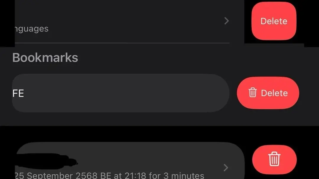
Why delete buttons varies across iOS apps
The issue of different delete buttons in iOS apps is not subtle, as a recent Reddit post points out. Swipe to delete an email in Mail and a single delete button style will appear. Go to Photos and try to delete the image and you will see a different interface. Open Settings, Notes, or any number of other native Apple apps, and the inconsistency continues. For a company that once set the gold standard for interface uniformity, these variations seem to undermine that effort.
“This is one of the first things I noticed about iOS 26; the buttons and actions were inconsistent and some changed position from years of previous iOS,” the user noted.
Apple has its reasons
According to Apple’s own human interface guidelines, the company encourages developers to tailor deletion actions to specific contexts. The documentation highlights that different content types may require different removal approaches with visual cues designed to suit specific workflows. Deleting a message in a messaging app carries a different weight than removing a photo from an album, and Apple’s guidance suggests that the interface should reflect these differences.
This context-dependent approach makes sense in theory. Different applications serve different purposes. And what works for one type of content may not work for another. However, the practical result is a patchwork of delete button styles, positions, and behaviors that can be distracting to users.
The human factor behind inconsistent design
Delete button styles are inconsistent between Apple applications
byu/rod8711 inios
Some of the variation comes from deliberate psychological designs. Designers refer to the Von Restorff effect as the contribution of v Medium points out. The effect is a cognitive principle that suggests that items that stand out are more memorable and salient. By making delete buttons look different in different contexts, designers try to prevent accidental deletion by ensuring that these potentially destructive actions draw the appropriate attention.
Apple provides developers with SF Symbols, a comprehensive library of icons designed to ensure visual consistency. However, developers often adapt these symbols to fit the specific personality of their app or to fit limited screen space. While this flexibility allows for better tailored user experiences, it also contributes to the fragmentation that users still notice.
Signs of greater design drift?
The inconsistency of the delete button points to a broader shift in Apple’s design philosophy. Multiple development teams work somewhat independently. Each of them optimizes the application for its specific needs. And that’s gradually eroding the strict uniformity that once defined iOS. Where earlier versions of the operating system contained rigid, enterprise-wide design standards, modern iOS embraces greater flexibility and context-specific solutions.
Apple enthusiasts who remember the company’s obsessive attention to interface coherence see a disturbing trend here. The question remains – does Apple see this as a deliberate evolution towards more sophisticated, context-aware design, or is it simply the result of an expanding ecosystem that is increasingly difficult to manage with the same level of control?